This is a project at my last company (a real project). When I first came here, I had absolutely no idea what I was going to do, what an EDC machine was, who its users were, what they faced when using EDC. My product manager shows me the old EDC display which still looks outdated, but works fine. The objective of the stakeholders is a more modern appearance and solves the problems of the users, better user flow.
It took me 10 days to learn how the EDC machine works, from me figuring out who the users are to cases like certain features being used. When I have learned well the SwipePay product and already know the objective to be achieved from this project, I begin to summarize all the problems and desired goals. I started with the first step, which was drawing and writing related ideas with a pencils.

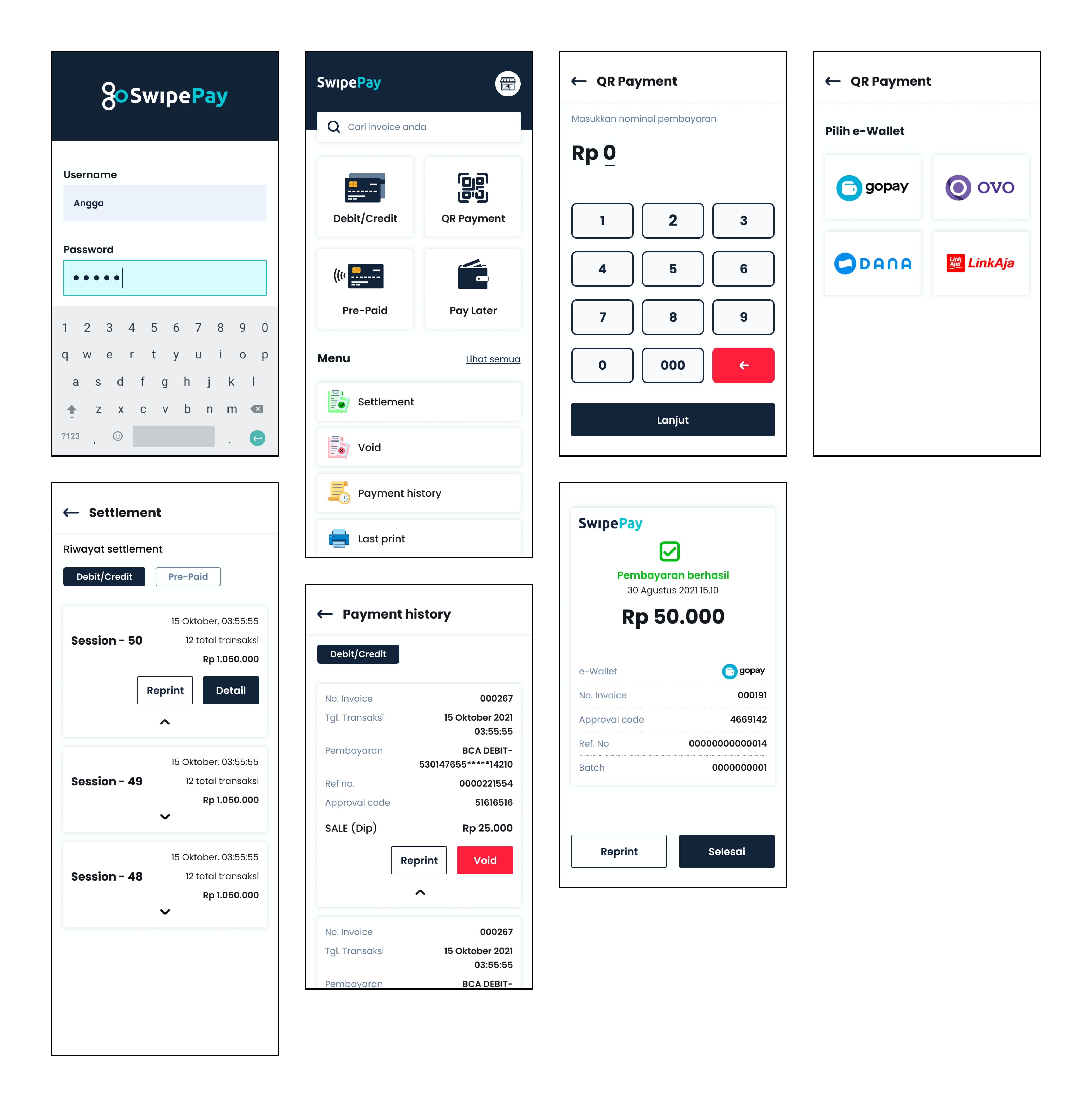
EDC SwipePay is a digital payment engine that is usually found in businesses such as shops, restaurants and strategic businesses that support cashless payments. EDC SwipePay can cover all payments both debit/credit, QR Payment and prepaid cards in just 1 EDC machine.
The development of the era that requires everyone to switch to digital products, one of which is payment. From the scattered data, there are 59 million small UMKM businesses, 680 thousand medium to large businesses. From this data, more than 90% still do not know or own an EDC machine (all over Indonesia) and 77% still use the cash payment system.
It is an opportunity for my company to launch a SwipePay product where the market opportunity is still very wide and there are not so many competitors. The problem is that some merchants (users) complain about SwipePay products due to poor application flow, loading that is still a little long, and the display is not neatly arranged.
The current interface looks old
Features and appearance of elements that are not neatly arranged.
Load the application which is still a little long.
Where when the situation is very busy (merchant), it is very overwhelmed to handle payments with EDC.
After knowing the problems and complaints from merchants (users), it took more than 2 weeks to summarize solutions that might solve user problems.
Some solutions related to the problem:
Create better user flow.
Include all the views that have the same purpose in order to be well organized.
A cleaner look.
Bigger button and font size.
Better user flow and easier to use.
Load apps faster.
A more organized and less confusing display.
"Make it easier for merchants (users) to use the EDC machine, both from the appearance and flow in the application"
Summarizes all problems so that it is easier to find possible solutions that can be applied.
Make flow better than before.
Making low-fidelity to high-fidelity and hand-off to developers.
At this stage, I am not too involved in getting out of the way because this research is done by the Product Manager. He has research results that users of the SwipePay EDC machine are between the ages of 30-65 years.
Flow that is not fast when you want to make a transaction from start to finish.
Difficulty when looking for previous transaction invoices.
There is no clarity on the void menu when you want to cancel a transaction.

Joko is a restaurant business owner named Kedai Juragan Bebek. He has founded his business since 2005. Joko started using SwipePay EDC in 2019. He often has problems such as wanting to find previous transaction invoices, lack of clarity in voids when he wants to cancel transactions, and the layout between features is difficult to understand.
Ease of finding previous transaction invoices.
Neatly organized application.
Clarity on the void menu when you want to cancel a transaction.
Business owner or cashier
Users want a more presentable appearance.
Users want previous transaction invoices to be easier to find.
Users want clarity on the void menu when they want to cancel transactions.
Users want a better experience.
Neatly organized applications.
Ease of searching for previous transaction invoices.
Clarity on the void menu when you want to cancel a transaction.
Better experience.
What if we provide a search invoice on the homepages menu?
What if when we want to void, we show the same invoice to the EDC machine too?
What if we only put the essential and frequently used features on the homepage?
What if we make the fonts and buttons bigger and the colors are not too contrasting considering that most of our users are middle-aged and above?
Below are some significant changes found from complaints by merchants (users) to resolve problems from merchants (users).

(if you want details about this product from SwipePay, don't hesitate to contact me)
(on the EDC machine using Korean because projects from Korea must first be developed)
Aesthetics is not important, the most important thing is how the design solves the problems of the user.
Knowing how the user uses the product is the benchmark for the development of a product.
Never use assumptions to start producing a product.
A product designer must have the capability to make good decisions based on the results of existing research.
.png)
